Learning to develop Jobandtalent’s design system for Android
It has been a year already since the product team started working following atomic design ideas. This article explores the results of this decision and what we have learnt since then. You can also check out the wonderful article that our iOS colleagues wrote!
One of the biggest challenges engineering teams have to face is balancing new developments while at the same time improving current codebase to avoid increasing project entropy. Jobandtalent’s android application was created more than four years ago and has never been rewritten from scratch. Despite the best efforts of the team, there are still modules in the application that look like growth rings, but instead of years, you could count redesigns, product pivots or team changes.
Even when using tools such as Zeplin, it was not really intuitive for developers choosing the appropriate references when styling, nor were they clear on wether a layout should be reused.. So when a year ago the design team proposed working with an atomic design we immediately signed up for it!
Design system implementation
To simplify, the design system code implementation is achieved by composing simple XML resources and custom views into more complex ones, over and over.

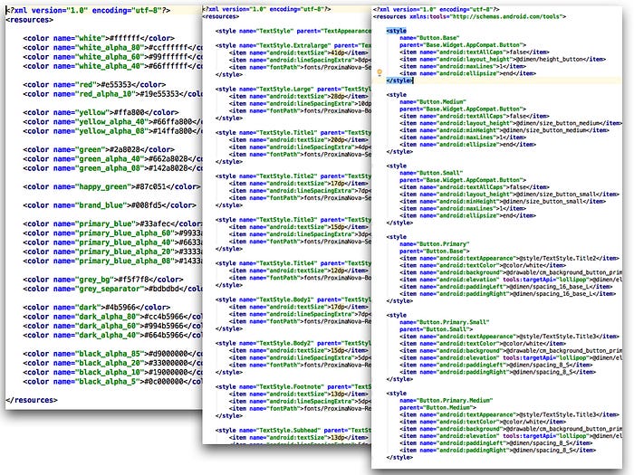
Typical Android XML resources become the atoms in our system as they are the simplest and most reusable elements. We work with a delimited colour palette, font-book built with styles, fixed dimens for spacings and sizes as well as animations, state selectors and drawables that are consistent across the application.
Molecules and organisms are both implemented as composite views encapsulating the view attributes, logic and layout. Simple public methods that accept the state of the view being rendered are exposed as the public contract of the component. The former are meant to be composed within the latter. As you go up in atomic design hierarchy this process is repeated, diminishing the required internal styling and configuration and becoming simple organised containers of reused components.
Creating screens and templates becomes easier and more intuitive. Check the design, identify the components, add them to the layout, easily set their style. It is the presenters’ responsibility to coordinate fetching the different information required for a screen, mapping from specific domain entities to state objects that have to be drawn. But there is always a tradeoff, and creating components now requires more effort. Just as any public API we need to be more aware of the contracts we are generating, avoid coupling them to business logic and have clear specifications that define their purpose and behaviour.
Composite views was not the original approach we decided. High level components usually act as a proxy, forwarding actions and state to the correct child. To avoid an overhead of such composite views, we started having simple layout composition through <include> tags. However we soon realised that this approach forced us to know about implementation details as the internal views were exposed in our activities, fragments or tests in order to interact with them. The more complicated the hierarchy, the more cumbersome it would be to find the proper view due to repeated ids. Also the more a component was reused, the more code we would duplicate.

Code organisation
The first issue we tried to solve when the design system implementation started was how to make easier recognising which pieces were already created and should be used when building new templates. With the idea that segregation would improve the visibility on this matter, we started by adding a new resources folder where we could place what conformed the new base resources and layouts that matched the design system.
At the beginning it worked fine, but as we started building more components polishing them out was a real pain since the project would take too long to build for the small changes required. It was clear we had to extract the reusable parts that conform the core of our design system from the application module. Having the components as a dependency allowed a small sample application to be created, which could help in their development. The application is quite useful as it allows you to fidget with values and get fast feedback of the changes, and as it is isolated from the application we can work out edge cases without having to bother with restrictions such as navigating to an specific screen.
Once a component is finished, the playgrounds that helped build them are left behind inside of the sample application. It has become an interactive reference for android and design teams, allowing one to easily review if the look and the feel is the expected one and to check how they behave across different android versions or configurations.
Be aware of something, though; at the early stage of a design system expect a lot of changes to happen. First of all there are many things to learn, and making mistakes teaches a lot but requires time-consuming corrections. Also while features are developed, new necessities will appear and more changes will come. Lastly, moving code from your main application to a separated repository means a more tedious refactor. During this stage it might have been simpler for us to have the components as a separated module in the same project.

Product development process
As you can see, most of this does not differ much from regular android development. But this should not be shocking as the change affected how the teams think and collaborate among them. As developers we tried to reduce final designs into repeatable patterns that we could code and reuse… but our decisions often deviated from the ones of the designers. Nevertheless, last year’s work has turned this over, and by assembling rather than deconstructing both teams are staying aligned.
As the system matures, we can rely more and more on the components library. From the product development perspective this reduces the burden of UI development, allowing us to shift our focus to feature requirements. It is not only related to the amount of code required to complete the task. For example, the consistency in the application not only benefited the users, but also ourselves. After a while it is easier to recognise the elements from design, even repeating patterns in styles, so there are fewer misinterpretations and mistakes. Also, as code is more concise code reviews become lighter and sharper.
On the other hand we have the components library, and as mentioned before the development investment has increased as a consequence. However, we found out that the effort pays off exponentially. Not only because there is less code to be written, but also because other tasks benefit from the reusability. Exhaustive design reviews can be done per component, whereas before it would not be as worthy when what really mattered was shipping a new feature. Another example can be writing custom view assertions or matchers that aid when building UI tests.
Conclusion
- Features have become simpler to develop. Components library moves most of interface complexity away from application, providing an easy way to build screens and reducing the amount of details to worry about.
- Our relation with design team has tighten, as we collaborate more often than before. We coordinate on new features to anticipate component creation, as well as improving existing ones.
- The sample application gathers the implementation of the design system and allows the whole team to explore and experiment solutions in a separated sandbox.
Overall, we have managed to improve our efficiency compared to a year ago.


